


 I first heard of Banks Violette when a colleague told me that another artist had made a melting unicorn head. I was bummed - since I was really fond of mine- and was wanting my idea to be unique. Now I see that his work and my work are actually nothing alike. The unicorn is almost an anomaly within his work - it fits but doesn't at the same time. His aesthetic is very dry, clean, masculine, shiny...and almost harsh. The unicorn's whiteness certainly goes with his other monochromatic work...and the idea of deterioration works next to partially torn down guard rails, crushed pieces of metal and scattered white tube lights.
In reading about Violette's work- his focus is on youth and subcultures. According to Interview Magazine, he celebrates 'their revolt and reveal[s] the queasy way they recycle images and slogans to keep themselves alive.'
Much of Violette's work is very pared down: to glossy black, white glowing light, white glossy objects, metal- it works around direct iconography or boils it down to image's base and individual elements (takes it apart and uses elements sparingly). The iconographic images (deer, Christ, skull, cross, unicorn) work in a separate space - where the images they represent carry their own history and weight- as iconic images do.
On the Brask Art blog - where I found the image of his studio with the upside down cross - the author describes Bank's work as:
'The cold, mimimalist visual language Banks Violette (b. 1973, New York) uses, refers to the dark side of American culture: the gothic scene, satanic rituals, death metal,....Violette's installaations evoke violence, aggression and excess, without lapsing into anecdotalism.'
With Bank's work - I'm turned off and very curious about how the cold, minimalist aesthetic carries violence across (vs. imagery that is not minimalist and not necessarily cold). I'm thinking of Barney's work which is also cold but not minimilast. Barney embraces the direct use of iconography. What does Bank's boiling down of iconography do in contrast (in those instances where it is boiled down.)? There is a way in which something cold shuts me out. It becomes institutional and, therefore, unavailable to me as a human being. (Institutional feels bigger than the indiv. human - out of our control in some way). Minimalism has its own distance. These distances from the individual viewer are different from each other - but both are removed.
If I think of Barney's work and my distance from it --- it is in it's coldness. And it's money that makes it bigger than myself. But he brings the human being back around to identifying with what is going on with iconography, historical imagery and fashion and the horror and abjection of the body. He scares us and revolts us with this abjection after we wait sitting in cold, clean well produced, gorgeous images that are familiar and otherworldly at the same time.
Barney and Violette both work with violence. I might have mentioned here before that Barney's work was described somewhere (or I made it up in my head but I don't think so) as 'violence sublimating into form.' I would say the same of Violette's work - violence is going through a different filtering process with the two artists.
A quote from Violette I found on Wikipedia:
"I'm interested in a visual language that's over-determined, exhausted, or just over-burdened by meaning. The heavy-handed one-to-one of 'black-equals-wrong' is incredibly interesting to me-- less as something that has a meaning in itself, but more in how those visual codes can somehow be reanimated. That's constant throughout my work. All those images are like zombies -- they're stripped of vitality, yet sometimes they get life back in them...and like zombies, usually something goes wrong when they awake again."
That is interesting -- he is stripping down (or boiling down) to something basic (like the use of black) and trying to reanimate it. I wonder if he has succeeded. I don't know. I only see stripped/boiled down right now. I don't see the zombie having come back from the dead.
I see boiled down death and violence - the leftover bones after the meat has cooked off.


 I went to David Altmejd's show at Andrea Rosen about a month ago (top two row of images). I was first struck by the sculpture in the front entryway. It was the semblance of a human body - with repetition and body parts in all kinds of places as hands repeated as if their repetition was motion against the body. There was a gaping hole in the torso with the movement of the plaster frozen in movement outwards to show it had been dug out by those multiples of hands. There were multiple ears at the bottom of where the face would be and an plaster was frozen in air like a single angel wing behind the body. It felt as if this messy plaster being was caught in building its mutilated self and torn apart by itself all at the same time. There was a raw plaster feel - nothing fine tuned except some parts of the hands and feet which seemed to be made by casts.
It's funny - thinking back - the hands all seemed to be not an individual's hand but some kind of representation of what a hand would be in a dictionary...it was a perfect, regularly proportioned hand..it was a man's hand - not too big, not too small. The fingers were perfect lengths for the base of the hand...there seemed a lack of individuality. This is purely based on memory. I didn't take notes.
I very much enjoyed the show. I liked the raw plaster building/digging next to the very large plexiglass vitrines. (Two filled a nice sized room.) I liked the juxtaposition of rough plaster next to very clean and straight lines. There was something medical in the cleanliness, yet also playful- upon seeing rows of various brightly colored noses displayed, a colorful flower built of thread and sewn through holes drilled in plexi layers. Clean. Exact. The vitrines seemed to be the location of the factory - with us viewing the human(?) body being put together in mid stream - human(ish) hybrids being constructed in clear clean boxes. Yet, some of the human parts take over and escape as hands dig through the plaster the vitrines sit on - there is some chaos here. On the wall above the vitrines, a winged figure was scraped out the walls plaster, multiple hands doing the work.
The color brought in humor. The juxtaposition of materials did too --- the hair on some of the half made abominations was something like the werewolf hair above. It was fake and campy.
Altmejd is known for using werewolf hair and crystals and making human like monsters. (I don't exactly remember crystals in this show but I don't think it matters because according to an article I read - he doesn't use certain materials to be symbolic --- it's more about mood for him.)
Altmejd has been coined as Neo-Gothic (along with Sue de Beer, Banks Violette and I'd put Wim Delvoy in that mix). I am going to look into this movement further within this blog- I am attracted to all their work....probably the dark and grim aspects that exist in all their work.... Banks Violette supposedly made a melting unicorn head (as I did in college without knowing of his)...Sue de Beer makes well done special effects horror images that are photographed and Wim Delvoy has a dark intricacy within his over decorated dump trucks...and then their are the Xrays...
According to a Wmagazine article on Altmejd - he went to school with Sue de Beer and Banks Violette. They all went to the Columbia MFA program...I would like to look further into what is going on with that school...seems like a little movement that I like has been going on there.
In some readings about Altmejd:
From that same Wmagazine article (by Catherine Hong) -
Altmejd says "A lot of people think that I'm really fascinated by death and morbidity, but I'm much more interested in life. I just think that things look more alive when they're growing on top of what's dead."
I like this for some reason... After all, we are all mushrooms in many ways. Life and death are the same thing. Personally, I think I need to look more at death. It is coming up in Kristeva's Abject/Horror book - and I'm just now realizing how much humanity, in general, is all about death. I don't want to go with horror or something super direct though --- maybe...
On the subject of death (as much as Altmejd isn't into that - it is in his work - so I'm going with it) - I just read in a separate article by Art Agenda on Portikus presenting 'The Future of Tradition: Aranda, picasso, Matisse, Miro & Vidokle'. They mention a poem written by Miro in 1975 titled Adonides.
Here is the entire paragraph from Art Agenda (written by Thomas Stearns on May 3, 2011):
"Miro's Adonides (1975) presents a short two-stanza poem. It begins in a poverty of understanding: I ignore everything I know / and know nothing at all / of all that I ignore. Once affirmed, the poem continues: How can I / believe in death / when I know/ that you will die one day. Elegiacally the poet asks, since death is an unknowable, its absence can only be felt in the loss of a loved one, a loss to painful itself to even consider. Thus, death is an uncomfortable mystery. As such, the denial and anger aroused in passing can only be alienated through a mystical faith: the cycle of life and death made whole through incarnation and resurrection - the rebirth."
I love what the poet and the Stearns is saying about the poverty of understanding!!!!!!!!! But also his noticing that death is something we can't know - really know - unless faced with a loved one dying really speaks to me.
Back to Altmejd:
Wmagazine article again- continuing in the vein of Altmejd's work being about life that grows out of decay -
Altmejd says, "I think about decay not in a negative way, but in the sense of creating a space for things to start growing, " he explains. The furry time-ravaged corpse of his giant, for instance, is full of holes and caverns inhabited by birds and squirrels.".... Meanwhile, crystals, plants and sparkling beads seem to be sprouting from the giants' flesh, which his also punctured with shards of mirrored glass. The end result is something undoubtedly horrific but also strangely seductive."
Nancy Spector is quoted in this same article as saying:
"Though his work is quite different from Matthew Barney's, both artists share a regenerative vision, one that finds expression in grotesque beauty."
Maybe this is one of things about Barney's work that attracts me too... I think I look at cyborgs the same way... human adaption and growth - whether containing technology or the organic - it is about hybridity, movement and change, growth and finally, the body.
Additional quotes from the press release at Andrea Rosen:
'Altmejd's work mimics the complexity achieved in the natural world through the continual layering of elements and structures built up over millennia. Whether Altmejd begins from a point of symmetry or from a point of disorder, his works are ultimately shaped by the individual choices made at each point of construction. these works suggest the organic logic of the crowd where individual decisions can collectively generate a more intelligent whole.......Rather than creating terminal artworks, complete and ossified, Altmejd's works are manifestations of objects that are always transforming and forever open. Rather than crafting puzzles for viewer to solve, Altmejd generates structures and landscapes to inhabit.'


 Always attracted to dark work, I immediately was floored by the Dutch artist, Folkert de Jong's, work. I have only seen it online, unfortunately, but look forward to seeing some of it, at least, this weekend at James Cohen.
Jong's signature is pastel colored styrofoam mixed with a lot of death and violence and some paint globs and some fine, fine face rendering - esp with styrofoam.
I grabbed these images from the internet and found this great article online about Folkert de Jong that I will piece through here. Mainly, I'm just writing a lot of her quotes down because I am so into everything she is saying and I want to write it down to implant it in mind.
Here are some words from Lilly Wei in 'Art in America':
'More philosophic than social-agenda-driven, de Jong is not a political artist as such. Rather, he casts a cool, appraising eye on human folly and destructiveness. For example, his challenge to the crude nationalism of conventional military sculpture takes the form of perversely humorous war monuments. Some observers have characterized these works as retrograde figuration, amounting to no more than kitsch or empty spectacle. But that judgement ignores the originality, power and seriousness with which he surveys the human comedy...De Jong in fact deftly contrasts the lightness of his medium and its seeming lack of esthetic gravitas with the hectoring grimness of his content.'
I agree with her assertion that his balancing the dark, heavy subject matter with the lighter color and chosen movement is where the power lies in his work - in the humor and macabre combo.
Later in her article, Wei points out that de Jong is criticized for using Styrofoam because it is toxic and an environmental pollutant....but that he uses it because it is integral to our lives as packing material for mass produced items and that the material's makers and environmental reputation is what interests de Jong in the first place. He also uses oil barrels, wooden pallets which speak to industry, money, trade as well.
More from the article:
"De Jong conflates past and present conflicts - the Napoleonic, Franco-Prussian and recent Easter European wars as well as those in Vietnam, Iraq, Afghanistan, Darfur and other countries - to arrive at a ubiquitous human phenomenon: our passion for killing each other. His dramatis personae are not obviously good or evil, and moral imperatives are displaced by an interrogative mode, by satire and black humor. 'History needs to be questioned," de Jong says.
Nice. I like that they all bleed together --- this keeps it philosophical and not political. It isn't about who is right and who is wrong in this moment - its about the fact that it never really ends...we always act the same generation after generation.
Aside from war and death, his work also seems to have elements of fantasy, the theatrical and narrative/action structure that provides multiplicity of character and critique.
Article:
There is "Cyan-Kali which is named after the Hindu goddess of time and transformation, death and annihilation....she is both seductress and slayer, ferocious but sometimes benevolent, the deity is an ideal de Jong subject in her multiple and opposing attributes, her ghastly, strange beauty."
One last thing from this article -- ( I really am into this piece)
Pertaining to de Jong's grandfather...
"He remembers being riveted, as a child, by the enchanting stories -as well as the elaborately tattooed arms and chest- of his grandfather, his last forebear to go to sea. (He comes from a long line of fisherman). In retrospect, de Jong realizes that those tales and body markings helped to reshape a meager workman's existence into something bearable, even heroic. Ultimately, the old man was intent on deluding himself more than others. Truth, the artist learned, has many facets, and life is seldom truly glorious- observations that undergird all his work."
I have multiple feelings on this quote. First of all, I love the very correct observation about life and glory. That is beautiful. Second, I'm a little turned off about how the grandfather is talked about.... I mean even if its the truth - it is as if 'the old man' is stripped naked by his grandson.
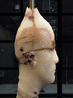
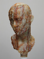

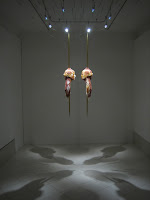 I'm interested in the slickness and texture of Barry X Ball's work and how that works with his human subject matter.
Skewered Portraits: Obviously, the skewered heads are violent - human heads (multiple or single faces) float in the air, skewered and hanging from the ceiling. The drape of material off the back of the neck is representative of skin/flesh hanging? What does it add to have this extra flesh instead of just the head? Only aesthetics? The skewer draws some of what would be skin from the top of the head towards the ceiling like a moment frozen of the skewer moving upwards through the skull.
I am writing this and becoming disgusted....yet I look at his work (only digitally so far) and it is mesmerizing and gorgeous. It is slick -marble or rock- (his work uses rare materials with intensive technical labor). The color of the stone contains (naturally?- i think at least on some of them) textures and colors that make the sculpture less representative of human - they become more of an object. The skewered hanging heads are displayed in a bare white gallery space with dramatic lighting. This slickness of the environment - how does that affect these pieces? Maybe they are more clinical? Maybe they are more revered and god-like, mysterious? Maybe they are fetishized or their object-ness is more apparent?
So many questions! What happens to a human representation that becomes so much about texture and color? The human element leaves to some extent....there is an interesting line there...between a human being represented and erased into the sculptural material's qualities.
I need to find more out on the Baroque (?) romantic nature of his work. How does that speak in comparison to other human representation in art?
From the article "Romanticism and the Work of Barry X Ball" by Monroe Denton:
"Ball embraced the theatricality of a Roman Catholocism that was at odds with the Christian fundamentalism in which he had been raised....the extreme emotionalism of wonder, totally bypassed in the art of the time, was Barry Ball's element. " (He arrived on the nyc scene in the 1970s)
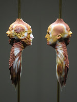
The top photos here are of Barry's sculpture of Matthew Barney made of onyx (the skewer is 24K gold). In speaking of Romanticism, Denton says:
"..Prometheus, Faust, Hamlet form the melancholy triumvirate. Barney is an interesting contemporary emobodiment (the theatricalized masochism - the stretched scrotum of Cremaster 1, the bloody mouth of Cremaster 3 would, one thinks, supply him with sufficient scares of his suffering".
That is interesting.... I never really thought of the masochism of Barney...although its obvious with his sport endurance tests too...
New research topic: Romanticism and Pain and Masochism
I wonder if its different for men and women.
To be exceptional and view the exceptional has varied meanings:
1. to be considered exceptional is to be considered - someone else has to consider you, someone else has to be looking and gauging in the first place.
2. to be considered exceptional is to be placed within a hierarchy - towards the 'top' in this case -only because exceptional is a word with positive connotations.
3. to be considered exceptional is to be unique or different within a group of people - there has to be a norm for there to be an exception.
4. It has to be lonely. It is separated from everyone else at least to some degree
5. ego inflating - depending on the person
6. When someone is pointed out as exceptional, it is usually presented as if the exceptional person can't help it - their exceptional-ism is beyond their control.
7. It seems as if - because it is just the way the person is naturally - that to be exceptional is easy for this particular person and hard for everyone else in the group - whether this is true or not
My guess is that it is not because usually to be exceptional takes a large amount of extra work.
8. Being viewed as exceptional is being viewed from a skewed angle - it does not encompass all parts of a group of people or individual person...it is only looking at particular parts of a situation or person.
9. To view someone as exceptional is to be surprised - at least to some degree.


 Which means "period, paragraph, Bluemli"
He had shown at the ICA in Boston - but I didn't see it. Gigi said he had paid a homeless person to come in and sleep in the gallery - so she didn't like his work and felt tainted by his probably using the homeless guy for his own benefit - so she wasn't into this show (yellow images above).
I, on the other hand, was into the show. It took me a second because at first sight, I was seeing gestural aspects as sloppy - which only works for me in a particular context. If it seems too non-art, too trying to get away with something... I don't know. There is a lot of crap out there that gets put over in a maschismo, young guy, brash kind of way....and to me it is overdone and maybe too easy.
But this show came over me in a subtle way.... the choice of colors together, the textures and lines...and the smell. The smell definitely drew me in.
It was probably the yellow paint covering the floors...the smell made me think of playdoh though. The texture and hues of colors in the show remind me of playdoh too - now that I think back on it. I wouldn't be shocked to learn that every color chosen for the show was based on official playdoh colors.
There was a wall of mugs that could have actually been made of playdoh instead of clay. But the smell was powerful (not quite overwhelming but not subtle) so I'm guessing it was the paint that covered the floor. The paint job was sloppy - it showed the black floor underneath in areas where the paint was thin or was unevenly distributed. It was sinister and curious in the way it bled from underneath the red velvet curtains when you first walked into the gallery.
I was especially moved when I saw the sculpture of the woman with the bowtie around her neck. (2nd row above). The colors, textures, lines, flatness mixed with pattern were extraordinary! She was like a half blown up doll or a half deflated human or a cartoon morphing into a human...you can get some of this from the photographs above - but not as much as being in her presence. Yes, I definitely love her. There is something dirty and scary about her (maybe use of material with that yellow smudgy ground)...
Here is a little bit of the press release that really struck me:
"With sycophantic excitement they conduct every modern day sacrament - murder, construction, commerce and hygiene (among others). Yet their tangled wills act not in the name of altruism or holiness, but from their everlasting yearning for life's sweet spots and the age-old wish to dissociate from (or marry) all carnal cravings. "
Modern day sacraments all being grouped into one - putting hygiene and commerce and murder together into the same group - and then calling them sacraments! That is just delicious.
From Wikipedia:
A sacrament, as defined in Hexam's Concise Dictionary of Religion, is what Roman Catholics believe to be "a rite in which God is uniquely active."
In taking these words and applying it to his work - I am enthralled but also don't know what to say beyond this...
I took the other (non-yellow) images from around the web - they weren't part of this show. I wanted to show some of his line and color in his paintings...
Jerry Saltz , in a review he wrote of Kai's work in 2001, stated his obvious influence of Egon Schiele. Also from Saltz's article 'History Painting' in the Village Voice:
"Althoff has a lyrical gift for depicting what Hans-Jurgen Syberberg, director of the 1980 epic Our Hitler, speaking of Germanness, called "the monstrousness from which we are made." Dealing in the cultish and something very male, Althoff uses nostalgia, fairy tale, irony, and sentimentality as levers to update the past. Foregoing the clean, urban, German cosmopolitanism of Gursky & Co., Althoff depicts a mysterious, demonic past."


